We could all do with a little colour in our world right now…
In the words of the founder and creative director of Designers Guild, Tricia Guild, “Colour is a joyful and instinctive pleasure. Life enhancing, romantic, magical. The ability of colour to transform surroundings, to excite a variety of reactions, to uplift and inspire is second to none.”
There is no doubting that colour is powerful and immediately affecting. Every moment of our waking life is connected with colour and it’s an integral part of the home we live in.
There are many and varied ways to bring colour into your home. Some people love a riot of bold colour and others prefer a palette of neutrals. And, there is everyone else in between.
At Allium, we see clients with colour preferences as individual as they are. While we are experienced at working with colours – choosing colour for your home is very personal.
Following are a few tips on how you might consider bringing colour into your home:
1. Choose Like Temperatures
Colours can be divided into two groups. They’re either warm or cool. Using colours with like temperatures always results in appealing colour combinations.
|
Try a combination of warm neutrals like soft gold, deep brown and rich ochre. This inviting and cosy bedroom is filled with earthy fabrics from the Elitis Escale collection which is available to view and purchase in-store. |
|
We love the rich, earthy sepia tones of this Designers Guild Maple Tree cushion with its intertwined magnolia flowers and colourful bird. Combine it with a Christian Fishbacher Alpaca throw in amber and our gorgeous Darcy Lamp for a mix of warmth, comfort and beauty. |
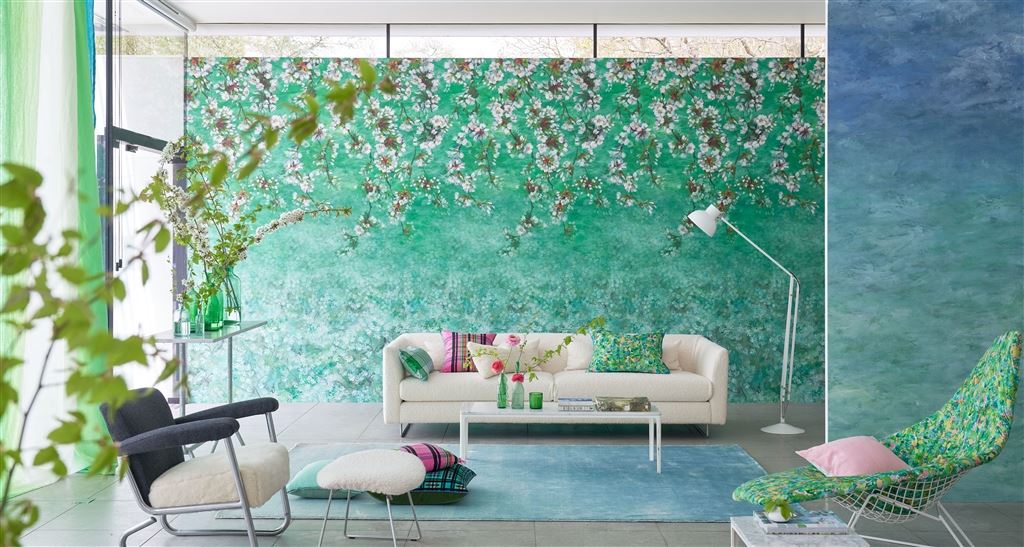
Choosing colours that are adjacent to each other on the colour wheel can give lovely and very liveable schemes.
|
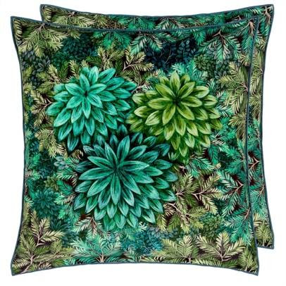
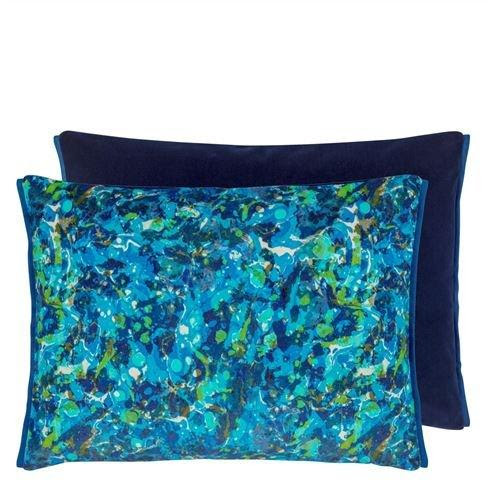
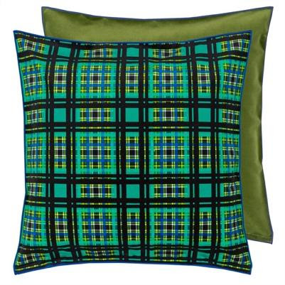
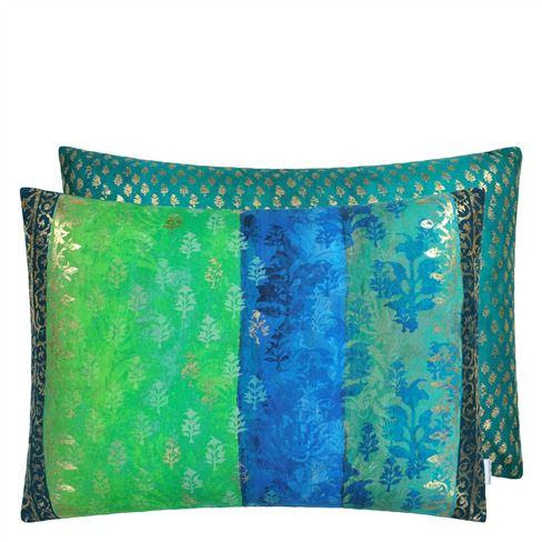
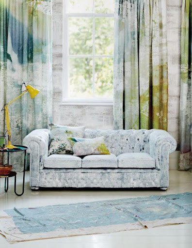
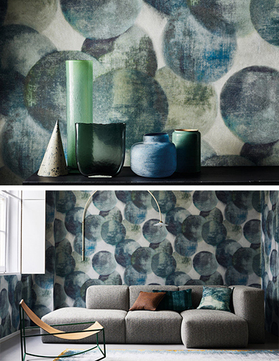
This combination of fabric textures with hues of emerald, teal and cobalt in the latest fabrics from Designers Guild is both unique and luxurious. Combinations of cool colours like these blues and greens always work well. |
| These stunning cushions from Designers Guild with their beautifully related blues and greens are all available to purchase through our store. |
 |
 |
Choosing colours opposite or near opposite each other provides a strong contrast and a dynamic effect. There’s no fear of colour in this new Designer’s Guild combination of vivacious colours, patterns and textures, it’s a visual feast for the eye. These vibrant pinks and greens may be opposites but they make a glamorous and exciting combination.
 |
|
Chennai fuchsia tartan check: woven in luxurious pure silk and embellished with a black stripe in cotton satin for a graphic modern touch. Combine this with the Fuchsia bed linen from Designers Guild and you will have a dazzling and quintessentially DG look for your bedroom. |
 |
|
Designers Guild Manipur Jade and Coral look beautiful when paired together. Add Grandiflora Rose drapery with its beautiful corals and spectrum of greens for contrast and cohesion. |
 |
|
A muted contrast in colour can be found in this stunning drapery fabric from Mokum. Lotus is a contemporary print with giant rhythmic waterlily leaves, lotus flowers and whimsical dragonflies. The mineral greens and blush pink are contrasting, with a soft effect. Lotus pairs beautifully with Mokum Bespoke upholstery velvet in blush or a deeper colourway like Atlantic. Visit the store to see these fabrics. |
4. Lose the drama
If the drama of contrasts isn’t for you, then a monochromatic scheme may be what you’re looking for. This is a scheme where one colour is used in variation of tone and tint.
To avoid the room looking flat, we’d enliven a monochromatic colour scheme with contrasts of texture and pattern. This use of colour creates calm, restful and elegant interiors and is easy to make work.
 |
| The blissful tones of green in this Kiyosumi Celadon Wallpaper combined with green textures, tones and patterns is the epitome of restfulness. Shown here is Seneca Sage Velvet Comforter and Designers Guild Biella Pale Jade bed linen. |
Whether you want to commit to an entire colour scheme or add some colourful accents to brighten up your home interior, come and start a conversation about colour with us today.


